OPI Spring 2008 Collection – India
 OPI, you don’t know this but we’ve been broken up for some time now. The fighting began when you revamped your formula last spring. The inconsistencies in every collection since Australia has been frustrating. I understand the pressure to go Big 3 Free but sacrificing quality in order to satisfy the protesters was a bad call if you ask me. Of course our fight occurred entirely in my head but I’m sure you’ll be happy to know that we’ve called a truce.
Why the change of heart? Well, two reasons really.
1. You finally delivered a navy blue shimmer that actually looks navy. No purple undertones. Not just another blue-black. Yoga-ta Get This Blue, it’s like you knew I needed you.
2. You realized that I was not the only unhappy camper in regards to formula and you found a way to deliver pigmented, streak-free, non-goopy cremes.
The OPI India Collection for Spring 2008 made me remember what it was that caused me to fall for OPI in the first place. How compared to all the drugstore brands of polish I had used, there was a line that applied smooth and even with a beautiful range of colors. My first OPI obsession was the classic; I’m Not Really A Waitress. My latest; Yoga-ta Get This Blue.
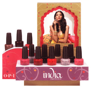
With a color range pulled from the fashion and culture of India, this collection is filled with vibrant pinks and reds, rich berries and luxurious metallics. Do I think every shade is utterly unique and rave-worthy? No but let’s get real girls. Us hardcore nail fanatics are a finicky group to please. I say formula improvements are a good step. Giving us the next Rainforest would be a fabulous and giant leap.
So this formula I am raving about, is it really that different? I wouldn’t testify in a court of law but, to me, there really is a noticeable improvement. I can’t find the change in the ingredient list but I’m telling you, something happened. With a couple exceptions, every shade applied like a dream. And disregarding the two sheers, these lacquers are highly pigmented requiring no more than two coats. Each image below was taken without a top coat and only two layers of lacquer.
Black Cherry Chutney – a blackened red with subtle shimmer for depth. In most lighting all you see are a few specs of shimmer and otherwise it’s just another almost black berry. The brush on mine has a few bent strands so that affected application. I hope it was just the brush but I can’t promise anything.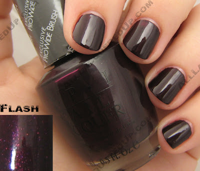 Charmed by a Snake – a lighter bronze, more appropriate for Spring. The champagne shimmer keeps this shade from being too warm and too Fall. Definitely one of my favorites.
 Curry Up Don’t Be Late! – I’m not gonna lie, this will be a hard shade to pull off. Brushed yellow gold is too much for my pale skin but, I would think with a faux tan or darker skin tone this shade could really pop.
  ElePhantastic Pink has been creating a buzz before it even hit shelves. It’s the shade I’ve received the most inquiries about. A bold carnation pink creme, this isn’t for the demure pink wearer.
 Get Me to the Taj on Time – is a safe opalescent semi-sheer. Yes, it applies well but we’ve seen this before.
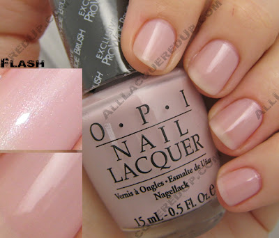 I’m Indi-a Mood for Love – a hot pink creme that leans towards blue, giving it a slight purple undertone.
 Keys to My Karma is your basic maraschino cherry red creme. This one has a lot of pink in its base and needs two coats to achieve the bottle shade. It’s a good staple color but not something you need. Still I’m feeling the urge to pull out my reds again.
 Lunch at the Delhi has been dubbed a “coral” but I’m not seeing it. If anything, I think of it as a dusty, muted red. Yes, it’s warm and orange based but not the pinky peach I typically think of when I hear coral. Sometimes an OPI description is so far off from what I’m seeing, I wonder if I’m colorblind. What shade do you see?
 MonSooner or Later is a tomato red creme. Orange and red combine to create this glossy confection. I can totally see this on toes at the beach.
 Moon Over Mumbai – get on the gray train now before it runs you over, leaving you face first in the dust. Of course the uber-chic nail boarders over at Makeup Alley have been frankening their own grays for months now but if you don’t want to make your own, here’s a nice soft version to ease you into the trend.
 Royal Rajah Ruby is the other vampy berry shade included in India. A rich wine shimmer, this shade would have made me take notice had it been a bit lighter. It just doesn’t stand out in the crowd. The shimmer adds character but no real charm.
 Yoga-ta Get this Blue! – I saved the best for last. I had to keep you scrolling. From the very second I got my hands on this shade I’ve been talking it up to anyone who would listen. Deeper and richer than Blue My Mind from the 2005 Brights yet lighter than all the 2007 OPI blues, Yoga-ta is everything I’ve been wanting a navy to be. It’s visibly blue in most lighting situations which is something many of the blues that came before it have failed to achieve. In the simplest of terms, it’s perfect.
 The OPI India collection is available in stores and online now and retails for $8.50 ($9.95 CAN). No that’s not a misprint, there was a price increase.
 Now let’s hear from you? What are you loving/hating, buying/passing on?
Comparisons are in the works but before I finish, are there any requests? I already have down Ms. DQ2′s desire for a China Glaze X comp but what else do you want to see? I can’t fulfill all your demands but I’ll do my best to please the majority.





Hi there,
Long time reader, first time commenter here, but I just had to jump in to see if you’d be able to compare Yoga-ta get this blue to some other navy shimmers, such as ChG Up all night or Orly Witch’s blue? and also, if it’s not too much trouble, could you tell me how OPI blue my mind and ChG Frostbite compare?
Hey, girl! I’m with Maggishness. Could you swatch Yoga-ta Get This Blue alongside the Chanel, Revlon, NYC, and all of the other look-alikes? Also, maybe a swatch of Black Cherry Chutney and Royal Raja Ruby against OPI’s Siberian Nights and Suzi Says Da?
Seriously, does gold look good on anyone? I tried a goldish sheer for the holidays, and I looked like a corpse.
I am so excited to hear that OPI has been working out the kinks in their new formula. I am a hard a true OPI user, but I have been a little disappointed lately with their less than stellar performance. With that said, what a super fun lineup of colors for this Spring and Summer!
I do have a couple comparison requests if it is not too much trouble: ElePhantastic Pink to Strawberry Margarita and Keys to My Karma to Vodka and Caviar. They just look so similar online that is it so hard to tell.
I LOVE ur blog!!! I’ve been waiting for u to review the OPI India collection!

Unfortunately, I just placed an order for 6 of the polishes, and after seeing ur pics, I might have to pick up some of the others too!
I’m with you on the Yoga-ta get this blue….a very hot way to replace Russian Navy for spring
I didn’t order MonSooner or Later…but I think I might have to change my mind!! That color is red-hot and sexy for summer!
Next, I am LOVING Elephantastic Pink!! It’s the perfect bright Barbie pink I’ve been searching for!!
I never would have guessed, but I’m really feeling the light bronze Charmed by a Snake!! It wasn’t one of the ones I was originally attracted to, as I tend to steer clear of brown shades, but this one is really nice!!
I ordered Royal Rajah Ruby but now am curious to how it steps up next to Siberian Nights…
Finally, call me crazy, but I think I’m quite feeling Curry Up Don’t be late! Next to blue, gold is gonna be the new it color for spring. Granted, it would probably look horrible right now, but in the midst of summer with a nice tan, that color is gonna be HOT
Now, I must procure myself a bottle of Charmed by a Snake!! It’s surprisingly gorgeous!
Hi, I’m first time poster here, but frequent NB’er. Can you do a swatch comparison of MoM and Essie Great Expectations? And give us your thoughts as well? I’m debating on both (LOL) but really, can just 1 satisfy my gray needs?
Thanks!
That blue is beautiful…I may pick up a bottle of that. I will admit that I might buy the Curry…but only with “Charmed by a Snake”, so I could wear them together. I think they’d look great paired up so the Curry has the Charmed to anchor it somewhat. They’d look lovely together in a french-type manicure, or on the diagonal next to each other.
But I do tend to buy nail colors in pairs…and I might buy the Karma to go with the Yoga blue.
I really like the Black Cherry one – looks very much like Midnight in Moscow, which I am currently wearing. I need to check that one out and the Ruby one at the salon today. One of them will go home on my fingernails today!
I wasn’t lemming any colors from this collection until I saw your pics!! Ack! I love your blog, no matter how many lemming it creates!
I like elephantastic and the ruby. However, I feel that I need a tan to pull off the elephantastic. Living in MIAMI that won’t be too hard!!! LOL….
: ( Looks like I’m the only one who is disappointed by this collection. I’ve collected several bottles from all the OPI collections since the Melodies release – but there’s nothing in this set that I want. It all looks like more of the same. There’s some almost-blacks which I’m boycotting. Most of the colors are really similar to other polishes from OPI that I already have (a lot of dupes, it looks like, of the Russian collection). The colors that aren’t similar don’t appeal to me. They dropped the ball, I really think they could have done more with the Indian color theme.
This might be the end of my love affair with OPI.
Maaaaan I’m really disappointed with the spring collections in general. Didn’t like the Essie collection. I ordered a ton from CG OMG but ended up not enjoying them as much as I thought I would.
T_T
*kicks dirt*
I’m with Stephanie on this one. OPI really missed the mark with this collection. When I think “India” I picture deep jewel tones and gorgeous brights. Turquoise, emerald, sapphire, amethyst. I don’t think blah pinks and the same old reds. I may buy YGTB, but that’s going to be it. I’m very disappointed with this collection. VERY.
Oh dear. This is the first time I’ve fallen in love with basically an entire collection, these are gorgeous. I probably won’t get them all since some are sort of similar! But this is going to hurt my wallet. Eeeep!
M, thank you so much for swatching these for all of us nail polish fanatics. You are the best!
I’m on the fence at this point. I need to see these in person before I make a decision on them.
Please tell us how the Yoga-ta compares to the new Chanel Blue Satin, which I just bought, and how Black Cherry Chutney compares to Midnight in Moscow.
Thank you so much!
Hugs!
I had a feeling this collection would be a point of contention for people. Very love/hate. To me, I see these shades as coming straight from the fabrics that inspired them.
You gals are going to request every blue I have, aren’t you?
I think this is a great collection! I ordered seven of the twelve shades, and I didn’t get the one classified as “coral” because corals look horrible on my skin. Now I wish I’d gotten it. And both reds, too. I’ll be placing another order soon…
Have you looked at the Nicole line? I don’t expect much from the “Nic Sticks” as nailpolish markers just don’t deliver like traditional bottle application, but the new Nicole bottle colors look fun, especially Respect the World and It’s Up to You.
http://www.nicolebyopi.com/#products/newspringline
I actually quite like the gold but I think it’s ideal for tan or caramel skin.
I am also pretty ‘meh’ about this collection too. It seems like my stash has dupes or near dupes of every shade offered here. The only one I am interested in is Curry Up Don’t Be Late, for the ‘dare’ factor of it. I might lean over to RRR, but want to see it IRL.
Charmed By A Snake looks close to Zoya Austine, the blue looks close to NYC Skin Tight Denim, and i will need to look closer at the other colors i have to find my dupes.
My wallet is thankful this time around
hey cincy, a lot of people are comparing Essie Great Expectations to Moon Over Mumbai, which do you prefer in terms of color/formula?
Comparing MoM & GE is on my list so you might want to wait for that before purchasing. However, I personally prefer Great Expectations because it’s more opaque and noticeably gray. I guess it depends on what type of coverage and shade you’re looking for.
Thanks! I just saw these IRL and your pics are helping me! I would like to know if Charmed by A Snake is similar to ChG’s soon-to-be-released Unplugged…??
please please swatch YYGTB with RN and revelon dark pleasures midnight affair
wow. very very disapointed…they look similar to other colors!! i might only get YGGTB cuz i like blues…but charmed looks like chg’s upcoming hybrid, RRR looks like their midnight in moscow, BCC looks like a maybelline, EP looks like strawberry margarita…sigh. i understand someteimes they repeat colors or collections, but this is ridicukous! they dropped the ball and couldve done so much better. this reminds me of their mexico and australia collex-same ol reds and pinks…get over the reds and pinks!!!
HAVE TO SAY THAT I AGREE WITH THE READERS THAT AREN’T SO THRILLED WITH THIS COLLECTION. SAW IT YESTERDAY AT ULTA AND FOR THE FIRST TIME IN ALONG TIME THEY DIDN,T HAVE ANYTHING I WANTED.
I HAVE BEEN USING OPI FOR ABOUT 13 YEARS NOW AND HAVEN’T SEEN ANYTHING THAT I CONSIDER REALLY GREAT SINCE THE BRITISH COLLECTION.
I JUST HOPE THAT THEY START COMING UP WITH SOME REALLY ORIGINAL COLORS, NOT JUST RETREADS OR THE SAME STUFF THAT EVERYONE ELSE HAS.
IF THEY DON,T, IT’S GOING TO GET HARDER TO PAY THE HIGHER PRICE JUST FOR THE NAME. MARYO
Thank you for those great swatches! I’m actually lemming The Curry one now.
Some comparison ideas: BCC vs. Black magic mountain/LPAM
I’m Indi-a mood for love vs. It’s toe-tally summer/Hottie pink/La Paz-itively hot
Lunch at the Delhi/Tropical punch
Oh good, thanks for the comments (and maybe swatches) on MoM vs. Essie Great Expectations, I just bought Great Expectations and am wondering if I need both (though I like the sheers so maybe yes).
I’d love to see Yoga-ta also compared to Orly’s Witch’s Blue, Essie Aruba, OPI Blue My Mind and Sally Hansen Electra. And maybe ChG Frostbite (I’m still wavering over that one because I have all of the above). I also have the Chanel Blue Satin and it seems very dark compared to Yoga-ta (I was actually a little disappointed in how dark the Chanel was, I’m looking forward to Yoga-ta).
Is Black Berry Chutney anything like Midnight in Moscow?
Love all of the swatches, your blog does a great service to those of us who’d love to see these close up and in person, but can’t find the darn things in stock and get tired of running all over town looking for them
Me again! I am thinking that Royal Rajah Ruby looks a lot like It’s A Doozi Says Suzi and also Suzi Loves Syndney, what do you think?
A “collection” is an odd way to catalog thid unlikely color/finish assortment. It just seems like a mishmosh of everything hoping to please all. I say jack of all trades master of none on this “collection”.
Individuallys some look okay and if the should learn from other brands and designers what the word “collection” means. Haven’t they watched Nina on project runway say “I just don’t see it”!
I’m going to have to check these colors out! I epecially love the 2 pinks & the 2 dark colors. How would you compare the Royal Rajah Ruby & Black Cherry Chutney to Midnight in Moscow?
BTW, love your blog!
gotta agree with a lot of folks, this collection is disappointing. The only one I’m going to look at is YGGTB, which looks fab. OPI has really missed the boat on this one.
For all you people saying that you don’t like these shades, you will, once you see all your friends wearing them they will begin to grow on you. Be original, take the plunge, wear them FIRST! I surely am……On my way in about an hour to pick up a few!!! YAY……
Thanks for the gorgeous swatches! I can see why you’re not dazzled by RRR’s originality, but it looks fantastic on you anyway. And, throwing my 2 cents into the coral debate: I think a “coral” can range anywhere from that hot red-orange to the softer pink-peach you were expecting. And yes, OPI’s color descriptions are frequently worthless…
Compared to the other red nail polishes in this post, I do think Lunch at the Delhi does have some coral to it (or maybe because it has the least amount of yellow flash to show through). Maybe you should make another post of all three red colours on one hand to make a more accurate comparison.
I’ve gotta say…I was underwhelmed at first. Cincy, your swatches made me want RRR, but the rest seemed like total dupes of colors I already have.
Until today! I actually went to Trade Secret and saw them in person, and I don’t think pictures do them justice. I picked up CUDBL and RRR, and I now want Charmed, YGGTB, and MOM.
I agree with a pp…these are the shades you will be drooling over when you see people wearing them in real life.
I went and bought the Black Cherry Chutney based on your pictures/review and I am in love! Also, you are right, this formula is fantastic, it went on my nails so smoothly and evenly. After looking at your pictures again I’m going to go out and get the elephantastic pink, that color seems like the perfect summer color.
OMG can I just get them all?! Gorgeous!
This is the best nail polish site I’ve seen. What a great write-up of the OPIs. I’m going to try the Curry…
Hello,
Great picturse! Thank you very much!
Please, tell me does Yoga-ta Get this Blue has more shimmer than Russian Navy ? Thanks !
I bought Yoga-ta Blue and Royal R. Ruby and I love both! I bought the Chanel Blue Satin and I hate the formula (love the color) as it chips like crazy. The Yoga-ta is bluer and goes on really well. The RRR is much richer than Suzy Loves Sydney. I really like it but I think it’s a better Fall/Winter shade to wear with grays and blacks. I really like the wear and application – RRR had great coverage with one coat.
YGGTB and Curry are in my shopping cart now, the other colors remind me of retreads as someone else stated… I think YGGTB is a lighter true blue, I have CG Up All Night and that is so inky, it’s going up and away for the spring. Perhaps OPI reads this blog and will step up their game, get some unique colors. China Glaze blew them out the water with their spring collection.
Yoga-ta Get This Blue is really gorgeous in person, very dark but visibly blue, but I got some tip pull immediately and it started chipping like crazy after just one or two days. I used Nail Envy Sensitive as a base coat and Poshe as a top coat, so maybe I’ll try it with a different combination. Really pretty color, shimmery and pearly looking at the same time
I bought Yoga-ta get this blue yesterday and I’m loving to bits. I had to apply two coats to have that rich deep effect but I adore it! I was a bit disapointed by this collection because frankly some of the colors are not THAT exceptionnal and being an India fan, there are so much more colors they could have included. But this shade made it totally worthwhile.
Anyhow, some strands in my brush were bent too, so what I did is pluck them out and it works even better as the brush is a bit thinner now.
p.s: nice blog
This is one of the few collections from OPI that I’ve been eyeing for a while.
I have been eyeing this collection for quite some time, and of all the colors in the collection the two that appealed to me were India Mood for Love and Curry Up Don’t Be Late.
Paired together on the nail (with Curry painted over the moon, and India painted over the tips) makes for a very BOLD and very GORGEOUS nail!
First time reader – love the blog. Lunch at the delhi – yes,I see coral. I think of coral as more orangey red and darker. This one looks good to me (missing Revlon’s Metro Mango from years ago). I also liked Monsooner – perfect summer toes! Otherwise the collection isn’t that fab. Liked your review of the Russian collection – might have to pick up some of those.
Hi, I’m trying to replace a shade of polish that is pink with gold undertones, sort of pearlescent. I can’t remember the name of the shade and thought it was part of the India collection, but it doesn’t look like it was after looking at these pictures. Does anyone have any ideas or suggestions? Thanks so much!
Jessica, possibly Chapel Of Love? I own it and it sounds like you are describing that.
MUST. OWN. CHARMED. BY. A. SNAKE.
just saying.
The blue is interesting, but did we really have to do all reds and golds in the India collection? A bit cliched, no?