Big 3 Free
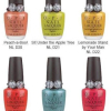
Dior Cristal Collection – Sweet Orange
 Dior’s iconic watches helped inspire this playful collection of radiant berries, corals and pinks. Running the gamut from edgy to sweet, the striking colors of the Cristal collection capture the fresh, flushed look of summer. Dior’s iconic watches helped inspire this playful collection of radiant berries, corals and pinks. Running the gamut from edgy to sweet, the striking colors of the Cristal collection capture the fresh, flushed look of summer.
While visiting the Dior offices back in October, I was treated to a preview of the Cristal collection and I’ve been chomping at the bit to get my hands on the polishes ever since. Seriously, I sat down and immediately focused on the three pops of color peering back at me from inside their sample bottles. Among a table full of beauty goodies, the summer shades sucked me right in. The Dior Vernis shades in the collection include Sweet Orange, Bubble Gum and Purple Candy. I had the opportunity to try out Sweet Orange and have bottle images of the others to show you. |
 Sweet Orange is a pink tinged sorbet hue flecked with golden shimmer. The formula reminds me of CND Toxic Perfection one of my all time fave corals and the base color is very close to Essie Cantaloupe. It’s on the semi-sheer side so even though I’m showing it with only two coats, a third wouldn’t hurt. Using the Dior Vernis flat brush, the polish flowed on smooth and even with no streaking or pooling.
Dior Vernis lacquers retail for $20/ea and launch in May 2009. Sweet Orange is a Sephora exclusive shade. Bubble Gum will be carried in specialty stores with Purple Candy at department store Dior counters.
Exclusive Preview – Lippmann & Rodarte’s Marquee Moon
 I remember
how the darkness doubled
I recall
lightning struck itself.
I was listening
listening to the rain
I was hearing
hearing something else.
Life in the hive puckered up my night,
the kiss of death, the embrace of life.
There I stand neath the Marquee Moon Just waiting,
Hesitating…
I ain’t waiting
-”Marquee Moon” lyrics by Tom Verlaine
One of the highlights of NYFW was getting to meet Deborah Lippmann. She’s such a force in the nail industry with her amazing polish line, roster of celebrity clients and editorial work. Though what totally floored me was that she was just as excited to meet me as I was to meet her. I’m not gonna lie, I was totally star struck.
We chatted the day before she revealed her second designer collaboration, Marquee Moon. This time around Deborah worked with the ladies behind Rodarte, sisters Kate and Laura Mulleavy. As a tease she stated that the color would be, “really really modern. Sort of space age.” That her fall and winter colors will be “out of the ballpark.” Well if Marquee Moon is an indication of what’s to come, we’re in for some truly unique polishes.
I have an exclusive preview of the shade to share with you. As you can see, the sequins she added to the gunmetal base look like tiny mirrors on the nail. Very futuristic.
Of course a full review and additional details are in the works. According to Nylon Magazine, the shade launches in June.
Barielle Sugar Rush for Summer 2009
 Sugar Rush is the alternative to last year’s neons -celebrity manicurist, Elle Sugar Rush is the alternative to last year’s neons -celebrity manicurist, Elle
Barielle spokesperson, Elle, created six hot candy colored lacquers for the Shades by Barielle summer collection and I’m loving every single one of them. We’ve seen candy inspired collections in the past but never with this kind of pigmentation, consistency in formula and hello, TWO GREENS!! To steal a line from Clueless, they give me a toothache just looking at them. |
I had the chance to speak with Elle about her latest polish confections and get her take on the collection. “It’s high voltage color but they’re more wearable. I wanted to keep it creamy, like taffy, with a lot more pigment rather than on the sugary edge.”
You know I’m a girl that loves her brights and Sugar Rush hits that spot dead on. Neons are fun and all but they can be too harsh if you don’t have the right coloring so these shades are definitely more my deal. I applied two coats of each polish and they flowed on perfect and even with pigmentation to spare.
Let’s start with my hands down winner, Sweet Addiction. I’m so loving these variations on dusty, minty greens. Sweet Addiciton, Misa Dirty Sexy Money, MAC Peppermint Patti and Essie Greenport are all on the same vibe yet surprisingly different enough to own them all.
Swizzle Stick‘s light azure hue makes me think of my college days. My sorority’s colors were white and azure blue and now I want to go dig out one of my old t-shirts to wear with this shade.
Can I just say that I’m so not over yellow? Lemondrops totally revived it for me. Yes, the pastels are safer and easier to pull off but give me a fab golden yellow and I’m in. Think of Lemondrops as a more pigmented, creme version of China Glaze Solar Power. Very similar base shade but with a different finish and pigmentation.
Cotton Candy really is the perfect descriptor for this hue. It takes me right to the fair. And the subtle sparkle reminds me of the iridescent quality of spun sugar threads. It adds playfulness and depth to the polish. I know my skin looks a bit ruddier than normal in this pic but that’s just to get the polish color right. It’s actually a bit more vibrant in person.
Grape Escape even more vivid in person that it appears in pics. It’s a pretty dead on purple. Not too dark, not too light. In comparison with the other summer purple, Lippmann Call Me Irresponsible, Grape Escape is definitely more pigmented and a couple shades lighter. All I can say is, LOVE!
Decadence is unlike any teal I own. It has amazing depth and fire, very much like a jewel. Being the only metallic-ish shade in the bunch, it definitely stands out. I like to think that if ChG Turned Up Turquoise and Passion In The Pacific hooked up, you’d get Decadence.
The Sugar Rush collection from Shades by Barielle retails for $8/ea and is available now on Barielle.com. And if you buy 2 colors, you get one FREE with free shipping on all orders over $50.
Essie North Fork Collection – I’m Smitten!
 It’s been a long time since I’ve been so over the moon about an Essie polish let alone a whole collection but when my eyes landed on the North Fork collection I actually shrieked. You can ask the boyfriend, he had to hear it and suffer through me holding bottles in his face saying, “Can you believe these are Essies? Can you? LOVE THEM!” Of course, as much as he tries to care and be involved in what I do, he doesn’t get it like you all do. It’s been a long time since I’ve been so over the moon about an Essie polish let alone a whole collection but when my eyes landed on the North Fork collection I actually shrieked. You can ask the boyfriend, he had to hear it and suffer through me holding bottles in his face saying, “Can you believe these are Essies? Can you? LOVE THEM!” Of course, as much as he tries to care and be involved in what I do, he doesn’t get it like you all do.
It’s not like Essie hasn’t stepped out of her conservative niche and given us some amazing colors, she has. Hello Starry Starry Night, Dominica Green and Summer 08 Neons. It’s just been a while. Well Ms. Essie, color me wowed. I seriously can’t compliment you enough on these gorgeous, sandwashed shades. |
The North Fork shades are the perfect beachy accompaniment to lazy days at the shore. Every single one makes me long for boating season even though I detest sailing. I like to think of the ‘rents sailboat as a floating condo. A great retreat until we get a powerboat of our own.
Anywho, back to the polishes. Each of these tranquil variations of blue is a winner in its own right. They are all shown with two coats and applied like a dream with the exception of Shelter Island which gave me a bit of trouble and required thee coats.
Greenport is a muted, creamy aquamarine. It’s not a traditional creme in that the finish is uber-glossy like a jelly even though the lacquer is way pigmented. Very unique indeed.
Sag Harbor is LOVE. OK not really but it’s a swoon-worthy color. It’s like dove gray and powder blue had a baby. This is totally random but it reminds me of a t-shirt I have from a bar at my fave summer destination, Put-In-Bay. It’s a purposely weathered blue and Sag Harbor is a perfect match. The shimmer in this one is subtle, adding just a hint of sparkly sheen.
Shelter Island is as blue as the sky on a hot, cloudless June day. It’s a bit more vibrant on the nail than in the bottle but not neon. Like I mentioned above, this was my problem child in terms of application. It has the same texture and feel as Greenport but for some reason it kept dragging at my cuticles even though I waited a few minutes between coats. Odd. The Essie North Fork collection will be available beginning in April 2009 at Essie.com and fine spas, salons and beauty destinations worldwide. Polishes retail for $9/ea US, $11/ea CDN.
What do you think kids? Are you feeling these blues?
Lippmann Collection Summer 2009
 Kids, I’m in head over heels swoony love and it’s all Deborah Lippmann‘s fault! Just when I thought I had my fill of lovely purples she just HAD to put out a perfect summery graple. Seriously, you purple lovers are going to flip for this. Kids, I’m in head over heels swoony love and it’s all Deborah Lippmann‘s fault! Just when I thought I had my fill of lovely purples she just HAD to put out a perfect summery graple. Seriously, you purple lovers are going to flip for this.
For Summer 2009, Lippmann Collection is releasing two new shades, It’s Raining Men (red creme) and Call Me Irresponsible (grape jelly). Check out my swatches after the jump! |
It’s Raining Men is your classic red creme but punched up in brightness for summer. It’s super pigmented, beyond pigmented. It’s practically a one coat red, which I love. There is a slight hint of berry in the base. No tinges of orange. It’s pure, cherry perfection. In looking for dupes, Essie Live From The Red Carpet is a close twin though it’s not as dense and requires more coats. Since Deborah is all about the music, I thought I’d leave you with a little Weather Girls and Frank to brighten your day. The Lippmann Collection Summer polishes retail for $15/ea and will be available at LippmannCollection.com and in stores at Nordstrom.
 Naming polish shades must be so fun for Deborah. With her musical background, she always chooses such catchy song titles for her lacquers. I mean, can anyone sit still when they hear “It’s Raining Men?” I know I can’t. After all I do own Pure Disco 1 & 2 and I’m not embarrassed to admit it. For the record, I own Pure Funk as well. I’m all about a compilation. And you really can’t go wrong with a classic like Frank Sinatra’s “Call Me Irresponsible.” I had the pleasure of meeting Deborah backstage at NYFW (more on that come) where she described this collection as “strong and beautiful.”
 Call Me Irresponsible reminds me of Rehab in that it has a jelly-ish feel only more pigmented, not as sheer. It’s not uber-pigmented so I needed three coats but come on, look at that color. Three coats is totally worth it! With its red tinged base, Call Me Irresponsible comes out more graple (grape purple) on the nail than the burple (bluish purple) hue in the bottle. And in spite of my mass purple collection, the only shade that comes close is CND Studio 54 though it’s not as vibrant.