
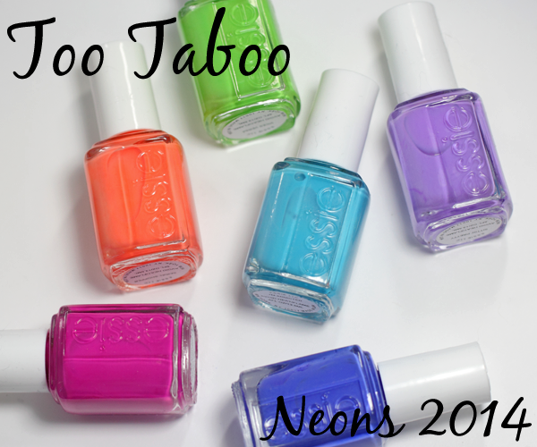
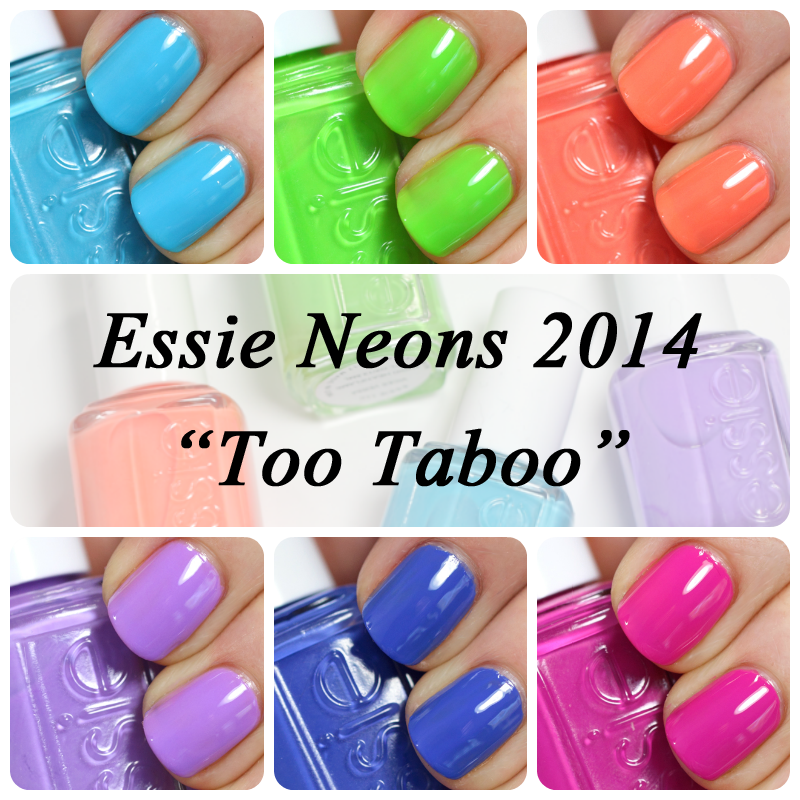
Essie Neons 2014 Too Taboo Collection Swatches & Review
Even though I own a bunch of day-glo neon polishes, I rarely wear them. They’re cool but the opacity issues and streakiness that plague traditional neons make them a bother to apply. Plus, they can be a bit too much for everyday life.
That’s why I find the Essie Neons 2014 so refreshing. They’re well pigmented and aren’t as in-your-face. That’s just two of the reasons it’s one of my Top 10 nail polish collections of the summer.
![]()
Formula & Application
Essie nail polish is 3-Free (Formaldehyde, Toluene, DBP). The square bottles are embossed with the Essie logo and the smooth plastic caps include an embossed ‘e’ on top. Bottles at mass retailers have stickers rather than embossing on the bottle. The brushes are thin, round and shorter than most. The bristles are very flexible, allowing you to easily fan out the brush to cover your nail width.
In this collection, the majority of the colors are semi-sheer with the watery texture we’ve come to expect from Essie. They become opaque in three coats, with a few exceptions. Too Taboo is more pigmented and gets it done in two coats. Vices Versa is really sheer and needs three coats. And Chills & Thrills is creamier and more pigmented but has leveling issues.
Try It On
Thank you for the positive feedback on my first “Try It On” video. Since the Essie Neons formula seems to be getting mixed reviews I made one for this collection as well. If the video doesn’t appear on your device, CLICK HERE.
![]()
Essie Chills & Thrills is a purple-based indigo creme that has hints of periwinkle. As I mentioned in the video, it has its application challenges but the color is so stunning, they’re easily overlooked.
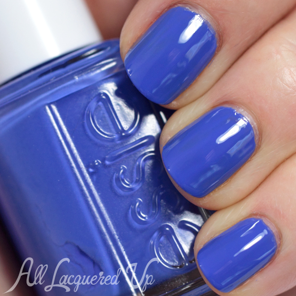
Essie Chills & Thrills
Essie I’m Addicted is a bright Caribbean blue creme. It’s a pure blue in that it doesn’t have any green in its base, like a lighter version of CND VINYLUX Cerulean Blue.
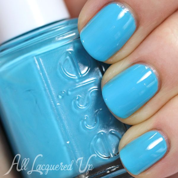
Essie I’m Addicted
Essie Serial Shopper is a punchy, peachy orange creme. In person it’s a lot brighter and the closest to a true neon polish.
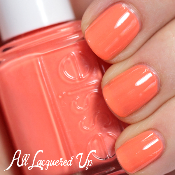
Essie Serial Shopper
Essie Sittin’ Pretty is a pink-based lavender creme. It’s not so warm that it gives me the dreaded “lobstah hands” but it’s close.
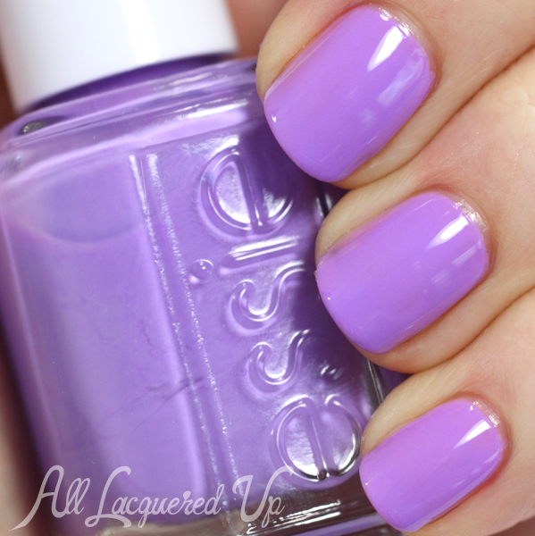
Essie Sittin’ Pretty
Essie Too Taboo is a hot fuchsia creme. If you wear it without top coat, it dries a little darker. Almost a raspberry with a satin finish.
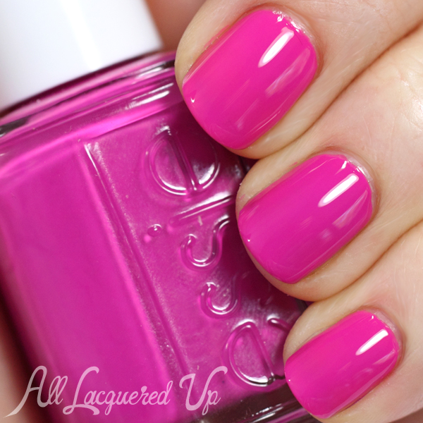
Essie Too Taboo
Essie Vices Versa is a yellow-based green creme. It kind of a chartreuse shade, though it’s not quite that yellow.
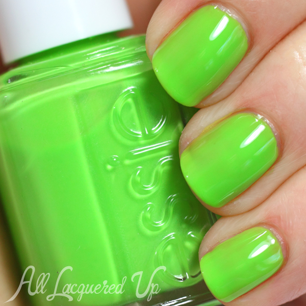
Essie Vices Versa
![]()
Bottom Line: Outside of Vices Versa’s opacity issues, I’m smitten with this whole collection. Yes, even the pink. They look great paired together and I love how bright, but not too bright, the colors are. Chills & Thrills and I’m Addicted are naturally my faves but, as I showed in my Multi-Color French, Vices Versa looks hot with Chills & Thrills.
Essie Neons 2014 “Too Taboo” collection is available now at salons and mass retailers nationwide. You can find them online at Essie.com and Nordstrom.com (gotta love free shipping). Essie nail polish retails for $8.50/ea.
What do you think of this edition of the Essie Neons? Which colors are calling your names? Do you prefer your neons old-school, day-glo or more subdued like these?


Those are some fun and bright shades. I like them.
Loving Too Taboo and Vice Versa!
Love these colours! These are definitely going on my must-have list for summer!
I’m wearing Sittin’ Pretty right now. I’m usually a blue and green person but recently I’ve been drawn to purples. I just used two coats but it’s going to be the base of a saran wrap mani so it doesn’t have to be perfect.
These are all sooo pretty. I MUST have both blues!!!!
Ooh, Chills & Thrills looks like a brighter version of ChG What a Pansy. (I could be completely off …)
I can’t seem to find my bottle to compare, I hate when that happens, but this isn’t as purple as What A Pansy
I love your try it on video. What a great idea. And the colors of these polishes are so pretty I may have to get a couple.
Thanks! I hope it’s helpful
love the video, so helpful! thanks for your awesome blog!
You’re so welcome. I’m glad you like it
Love love love your Try It On videos! So helpful. I’m selfishly hoping you’ll abandon your life and devote it to doing more videos, lol.
Ha, I’ll get right on that. I’m sure my boyfriend, family and friends wouldn’t mine if I never saw them again and just made videos all day.
I’ve never had my nails done professionally, Michelle, so watching your videos is as close as I’m going to come to learning how to apply polish efficiently and cleanly. They’re *very* helpful and at the same time reassuring — I’ve read a lot about how to do a “proper” manicure, but it’s intimidating when I do something differently because it makes more sense or is more comfortable for me. If you’re looking for topic suggestions, I have two: demonstrate a start-to-finish manicure; and show us (in slow motion if necessary!) how to wrap our tips.
Hi Sierra! Wow, that made my day. I’m so glad you’re getting something out of the videos to help your application. I love your ideas and will do videos for both.
Love the collection. The colors are bright and fun.
I bought vices versa, i