
Spring 2007
I Must Be Mad
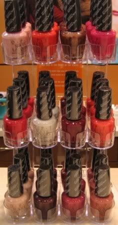 I have to be at least a little bit crazy. I don’t doubt that the employee at my local Trade Secret thinks so. I decided to stop by tonight because I heard that some stores, not necessarily Trade Secrets, already have the OPI Australian collection for sale.
I walked in and much to my dismay, no Australian collection. They did have the new Essies out and some of the OPI Brights are on clearance but no Aussies. I decided to ask about the collection, in case they had received it but not put it out. Sure enough, it was sitting back in the salon area all ready for the February 7th launch. I asked if I could take pictures of them and even though she looked completely confused by the request, she pulled out the display and let me snap some shots. I told her I was writing an online article but all she wanted to know is if she’d get in trouble.
A few customers came in while I was taking pictures so I apologize for the poor quality. I didn’t want to monopolize the counter and block the register so I did the best I could in fluorescent lighting. I can only imagine what those ladies thought when they walked in the store and saw some loon taking pictures of polish.
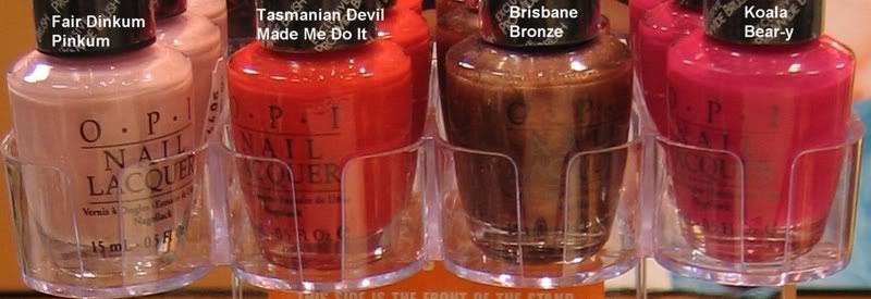
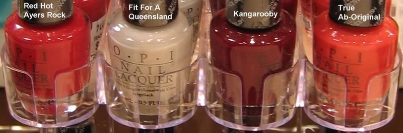
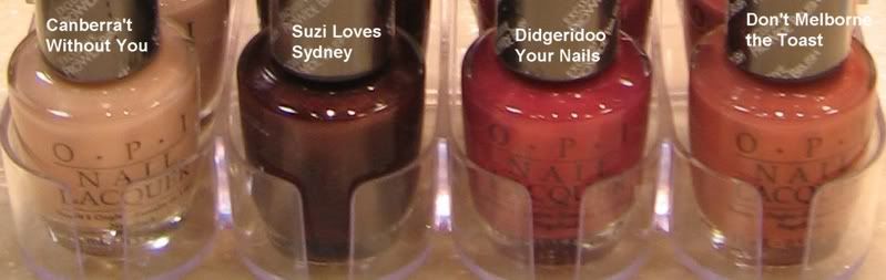
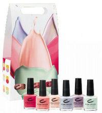
Here are some close ups of each row with labels.
NOTD: Creative Hyper Fresh
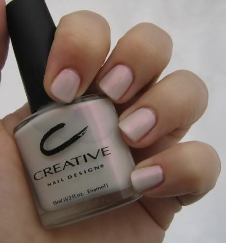 I’m continuing with my “Dare Week.” I was dared to do a white creme but I don’t own any of those so I chose Creative Hyper Fresh from their new Optix collection for spring.
Creative Optix Collection
 *inserts foot in mouth* Alright, I was wrong, the new Creative collection isn’t a redux of Spring 2006. I know that no company would be stupid enough to do that. Give me a little slack though, the pics I saw online weren’t that great. And, seeing them on a nail display makes a HUGE difference.
 The only color I don’t have to show you is Milky Way, the iridescent lilac and I didn’t have enough open spaces on my nail display to show you Hyper Fresh. Though I doubt it would translate well.

Creative Nail Design Spring 2007 – Optix
 There isn’t a lot of info to be found about Creative’s spring line. These few pictures are the best I could do. Optix is the name of the new collection but to be honest, they might want to call it “Spring 2006: Part II” Some of these new colors look like they’re just a deeper version of what we saw last year. I’m just hoping they’re more opaque. Especially the green. You know I’ll have to have it.
 Top Row (l-r): Milky Way: a lilac patina, Cosmic Coral: an edgy peach shimmer, Hyper Fresh: an opalescent white
Bottom Row (l-r): Aqua Jet: an opal mint lustre, Blue Nirvana: a translucent periwinkle, Pink Chrome: an opalescent pink

Spring: The collections have layered, sheer fabrics in pastels with translucent undertones. To complement these we have nail colours such as cosmic coral, blue Nevada, which is great with jeans, a soft luminescent lilac called Milky Way, aqua green and pink chrome. Hems are shorter and necklines are higher, so the accent is on legs and perfectly polished toenails are important. There is also a trend for a futuristic look which will see longer nails with a metallic silver or gold tip and Swarovski crystals on the nails.
Summer: The little white dress is big. We have designed longer almond shaped white eyelet lace nails and marblising effects to go with the dress. Glittering gold nails will be big and we have experimented with crocodile prints with metallic chocolate brown on gold. Lavishly decorated feet will also be the trend in summer 2007. Red, fuchsia and gold are the main colours of the season.
Autumn/winter: The attitude of the season is imperial anarchy or a London punk rock look with a regal touch. There is a lot of plaid with metallic undertones. Our palette for the season includes burgundy with bronze undertones, anthracite metallic, copper pearl, royal purple, metallic burgundy and fuchsia.
OPI Designer Series Comparison Pics
Here are some comparion pics of the new Designer Series polishes. Just trying to save you all a few dollars in case you already own some of these.

 To my eye, Amethyst is a bit more pink than Sand-erella and has way more holo bling.
Glamour is truly unique and I couldn’t think of a color combination that would come close. The burple (bluish-purple) base is very unique.
Passion is more rose toned than Elegance. I thought for sure that they’d be twins. Passion is definitely a more muted pink than Elegance. As much as I was initially unimpressed with it, I’m now happy to have it based on this comparison.
Desire is Design’s darker, more bronze, winterish sibling. Because of the amount of holographic shimmer in Desire, it’s hard to catagorize it as a warm or cool color. The base is definitely warm but when the light isn’t causing the holo to show off it’s rainbow beauty, the shimmer looks silver.
For anyone that hasn’t tried this line, the glitter is as smooth as the diamond dust formula is to apply. I love that it’s easy to remove and doesn’t give you that nails on a chalkboard feeling as you rub it off, like with a lot of glitter polishes.


