Fall 2007
Orly Neue Neutrals
 Unlike all the other brands that are giving us bold and unusual colors for fall, Orly went down a different path. The Neue Neutrals collection will definitely appeal to the general buying public with it’s range of “neutral” pinks, berries and plums.
Let’s face it, while it seems like there are a ton of us who LOVE greens, blues, holo shimmer and glitter, we are seriously in the minority. Orly realizes this and addresses the need for color basics with this collection. That’s not to say all the colors are boring or unoriginal but they probably won’t be the next Chanel Black Satin.
One thing I’ve always loved about Orly polishes is the rubberized black cap. It’s so comfortable and easy to grip. I feel that it really helps with application. Now maybe I just got an odd bottle but for some reason the brush in Plum Noir was thinner than the rest. I hope it was just a fluke. Ok, on to the colors.
Too Much Bubbly is a hard one to describe. It’s a champagne but with silver shimmer and can look a bit pink in the right light. It’s not a color I’d choose but it’s unique. My mother will undoubtedly love this. She loves gold, silver and metallics. This is two coats and as you can see, it’s still a bit sheer. Due to it’s metallic nature I expected brush strokes to be an issue but they weren’t.
Not So Dusty Rose is a pretty silvery pink. The subtle silver shimmer keeps this one from falling flat. I’ll have to do a side by side comparison but this may be similar to OPI Rosey Posey. The application on this one was flawless. I was extremely impressed.
Quite Contrary Berry did nothing for my skin tone. It looks like a browned raspberry creme, applied well, only needed two coats and left a high gloss shine but just isn’t my color.
Not Your Mama’s Mauve is deeper than the typical “pukey mauve” as coined on the nail board. In my opinion this shade is best suited to darker skin tones. Like the cremes in this collection, Not Your Mama’s Mauve applied extremely well. Now as much as I expected to hate it, when I saw this color on my hands, I couldn’t stop staring. It’s not like this is some mesmerizing shade but for me it’s completely out of my comfort zone. Tell me in the comments if Not Your Mama’s Mauve is a “keeper or crap” on me.
Vanguard Violet looks more berry than purple to me but hey, I’m not in charge of the names. It has a pretty metallic shimmer, similar to the finish on Too Much Bubbly and just as nice to apply. The shade definitely leans to the purple side of berry but I’m still not calling it a purple.
Plum Noir is a glossy vampy plum and is sure to be a favorite of dark polish lovers. I’ve seen a few comments saying this is a twin to Zoya Lael or a as Shammy so eloquently put it, “sisters from another mister.” I still need to investigate for myself. The Neue Neutrals collection is in stores and online now. I recently saw it at Sally Beauty Supply but supplies are limited.
Anyone bought these yet? Thoughts?
Creative Imperial Anarchy
 I know you all have been dying to know what this collection was going to look like. While the color blobs give you a clue, they don’t do much else.
Well let’s just say that Creative got it right. The Imperial Anarchy collection is filled with bold, rich, highly pigmented lacquers. I don’t care if Creative polishes take longer to dry than other brands, there are some shades here that are must haves.
Due to popular demand, I am going to attempt to give you full mani swatches as often as possible. It’s a killer on my nails and cuticles but sometimes you have to suffer for beauty and art. Also, in attempt to deter the picture thieves I’ve FINALLY learned how to watermark with Photoshop. So I apologize if it detracts from the pictures but it’s a necessary evil.
First up, Crowned. Described as a “vintage copper metallic”, Crowned applied very well for a metallic. I saw some slight brush stroke marks but they were nowhere near as bad as others I’ve used. The shade is a muted, softer version of OPI’s Burning Love which to me is the color of copper wire and hard to pull off.
With all the swatches below, I only needed 2 coats because these lacquers are so pigmented. Most of them didn’t even need a second coat, I was just hiding my own application errors. I planned to use a top coat to make sure each shade looked it’s best but it wasn’t needed.
Regal Revenge a “dark fuchsia creme”, went on so smoothly that I regretted not buffing my nails before swatching. An imperfection on my index finger caused a bump that should not reflect on the Regal Revenge’s quality. The slightly dusty quality of the shade keeps this from being a summer bright and will go well with the pop art inspired fashions that rocked the fall runways or as a nice punch of color with a smoky gray ensemble.
House of Rebels isn’t browned or orange enough for me to consider it a “brick red creme” but it’s definitely deeper than your traditional true red (i.e. OPI Got The Blues For Red) and extremely glossy. It’s not quite a one coat red but it’s very close. There’s no pink undertones like Burn from the Flash Point collection had. Look out for this color or ones similar on the young Hollywood set this fall.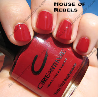
Crimson Uprising is a “shimmery crimson” that leans towards berry due to a slight pinkish undertone. I would consider it more frosty than shimmery but definitely not metallic. The application was too good for it to be called a metallic. The sliver and red shimmer give the shade depth and warmth. I wouldn’t say it’s entirely unique but it’s definitely pretty.
Rock Royalty is the first of my two “must have” polishes from this collection. It was described in Creative’s press release as a “dark purple creme” but from the close-up shot you can clearly see it’s not. The shimmer is comprised of very fine flecks of purple and pink that really only show up in direct sunlight but they’re there. The color itself is simply stunning. It’s what I had hoped the way too sheer OPI You Ottaware Purple would be. It’s not so dark that you can’t tell it’s purple yet it’s dark enough to be vampy.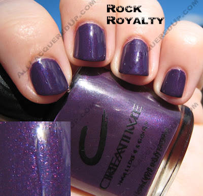
The piece de resistance is Hyde In The Dark. A “metallic anthracite” or as I like to call it, sparkly gray goodness, it’s not a metallic in the traditional sense, it’s a thousand times better. Loaded with shimmer and glitz, this is what gunmetal gray should look like. Now I don’t know what makes this formula different but it applied the best of all the polishes. I took pics of this one in both shade and sunlight to show off it’s glory.
 So everyone, what do you think? Are any of these tickling your fancy?
*edited to add: Imperial Anarchy will release in September. I don’t have an exact date.*
New OPI Designer Series
 Just released, the new Designer Series polishes from OPI. Being a holographic glitter junkie isn’t easy. As much fun as it is having a prismatic rainbow on your nails, it’s not always appropriate or safe. There’s been times that I’ve found myself distracted by the sun catching my holo mani while driving. Shh, don’t tell the police.
So now to add to my already large collection of “shiny object” distractions comes Fantasy and Diamond. I don’t have these little beauties in my hands yet but I will give proper reviews as soon as I do.
From what I can tell, Fantasy looks like a navy blue holo. I’d imagine it’s what we originally anticipated DS Glamour being. Don’t get me wrong I LOVE Glamour, it’s one of my holy grail pedicure shades but I know that in addition to the clamoring for a black holo (OPI My Private Jet) a navy holo was on many a wish list. Let’s cross our fingers and toes that this is it.
 Now I don’t want to pass judgement without seeing Diamond in person but I’m guessing it won’t be a very “me” shade. It looks pewter and I don’t don’t do silvers very well. If I do a metallic, it’s usually gold. I’m keeping and open mind though.
 These new Designer Series polishes are now available on Head2Toe Beauty’s website. Don’t crash their server!
photos: Head2Toe Beauty
The Lubu Manicure
 Originally created by Zoe Pocock of the Charles Worthington salon in London, the Louboutin Manicure received a lot of press and attention from the fashionistas and nail lovers alike.
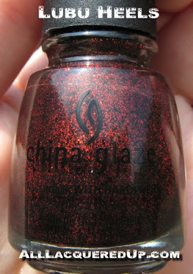
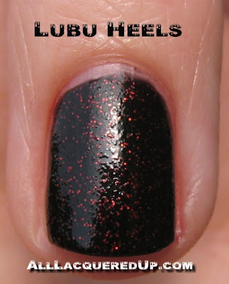
Inspired by this sensation, China Glaze has come up with their own take on this fashion forward look. Using the uber sparkly Ruby Pumps as the “sole” and their newest creation, Lubu Heels, for the “upper”, the Lubu Manicure is a glitzy, more Hollywood version of Ms. Pocock’s design.
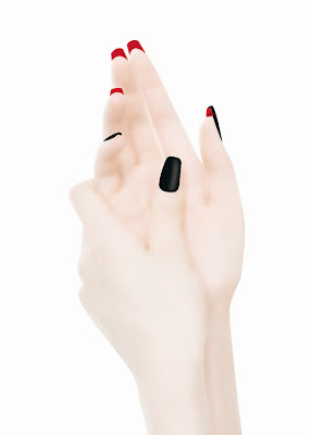
Lubu Heels is a shade I know a lot of you have been waiting for. For anyone with Rescue Beauty Lounge Revamp or Revlon Black Strobe on your wish list, you can cross it off. Lubu Heels is the black polish with red glitter that you’ve been dreaming of. As is typical of most glitter polishes, Lubu Heels has that familiar bumpy texture and I’m sure it will be a pain to remove but that’s the price we pay for glittery glam.
Essie Fall 2007 – Glamour Girl
 Glamour Girl is the fall collection from Essie. Hitting stores on September 1st, it’s a rich collection of shades that stays true to the Essie reputation of playing it safe and delivering pretty, traditional colors.
Looking at the shades, I’m feeling a 40s retro vibe. It makes me think of tailored suits, pencil skirts, peep-toe heels and patent leather handbags. I could see using Material Girl for a half moon mani or having Alligator Purse peeking out of a pair of chocolate brown open-toe pumps. The colors are:
Alligator Purse – a creamy burnt orange
Bags to Riches – light caramel taupe
Decadent Diva – rich shimmering cocoa
Handle With Flair – dark merlot
Material Girl – blackest purple
Turning Heads Red – striking red
 Turning Heads Red is a true red creme. It took 2 coats to get the bottle shade but it applied evenly and has a nice glossy finish.
Alligator Purse is one of my favorite shades of this collection. I’d describe it as more of a brick red creme than a burnt orange. It’s highly pigmented and was true to the bottle color with one coat. Warmer tones should run and grab this as soon as it hits shelves.
Bags to Riches is so not my color it’s not even funny. It looks like a really light cup of coffee. In fact it reminds me of those Aroma Cafe shades that China Glaze put out a long time ago. I honestly can’t think of anyone this color would look good on. Not only that but it was extremely streaky. The swatch above is after 3 coats and it still wasn’t even. If you can make it work, more power to you.
 Decadent Diva is my hands down winner for best polish of the collection. It has depth, incredible sparkle and shimmer and applies extremely smooth. A rich cocoa shade, Decadent Diva could fill all those Essie Martini Cocoa lemmings out there. It’s deeper and slightly redder and nothing short of stunning. Pictures truly can’t do this one justice. You have to see it on the nail to appreciate it.
Material Girl is a blackened plum creme, along the lines of OPI Lincoln Park After Dark. It’s hard for me to properly evaluate this one because the bottle arrived to me with some damage. The lacquer had leaked and caused some thickening of the formula so it applied streaky and too thick. I don’t believe my issue is indicative of the polish in general.
Handle with Flair is a wine red creme. It went on a bit uneven and took 3 coats to get the color you see above. It’s a pretty color but nothing I’d call unique.
Even though sunlight has been somewhat rare the past few days, I did manage to grab a quick shot to show off the shimmer in Decadent Diva.

I also did a quick comparison with Martini Cocoa.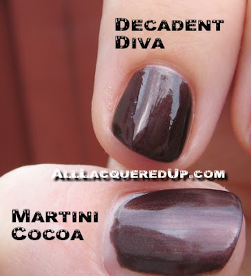 I know the fall collections are going to drain a lot of bank accounts. Which shades of Glamour Girl are going to make you open your wallet?


")