
Creative Summer 2007 – Flash Point
 So I just got my blue-tipped claws on the summer collection from Creative Nail Design. It’s called Flash Point and consists of a nice selection of brights and a metallic sheer.
I have to be honest with you all, I’m not wowed by this lineup. But I know that having so many polishes makes me extremely jaded. After seeing hundreds of red and pink polishes over the years, it takes a lot to get me jumping up and down over a color.
That’s not to say that these aren’t pretty colors or that Creative doesn’t make a great product. They absolutely do. The pigmentation in their lacquer is fantastic. It’s just that for the hard core collectors, there isn’t a truly unique shade here. I’m sure it must be hard for all the brands to come up with 4+ collections a year and try to make them special and trendsetting.
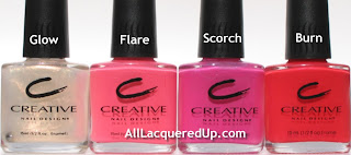 Let’s talk about the colors. I was so excited to read that Glow is a “nude gold shimmer” only to have my heart sink when I saw how sheer it is. But fear not, there is a silver lining on this one folks. For any of you still on the hunt for the discontinued FingerPaints Snow Angel, you can stop searching and pick up a bottle of Glow. The shimmer/glitter is a bit less dense but otherwise they’re dead on dupes. That’s a reason to rejoice!
Flare is a medium carnation pink creme. It’s a great pedi color that will compliment most skin tones. Even without my full on self-tan happening, holding Flare against my skin instantly warms me up.
I held Scorch up to my Bright Pink Lemming Wheel (or nail art wheel) and it falls somewhere between OPI La Pazitively Hot and Zoya Fergie (closer to Fergie). The pink shimmer is very fine and gives Scorch a lot of depth in bright light.
Describing Burn as a “bright hibiscus red creme” does absolutely nothing for a plant killer like me. I have murdered many an expensive flora over the years. In dissecting a color what works best for me is comparison. So in Burn’s case, I look to my collection.
Although it’s described as a creme, I see some minute shimmer up close. And even though Burn is slightly on the orange side, it’s nothing like OPI Cajun Shrimp. I think the fuchsia shimmer that prevents that from happening. China Glaze Hot Lava Love comes close but Burn is brighter and much more pigmented.

A close up look at Burn and Scorch


 Opinions? Got suggestions for duplicate shades? Let’s here it!


Thanks for the great pics! Is the Glow color similar to Essie Tennis Corset? I think Tennis Corset might have just a little bit more shimmer, but they seem pretty close to me.
Hi Christine! I’m not really an Essie girl so I don’t have Tennis Corset to compare. From the pics I’ve seen on Cat’s gallery site, the shimmer/micro-glitter in Glow is denser and more golden sunset than gold.
i like glow!! i hope it looks more silver than covered with gold irl!
Hi Yummy411! Sorry to disappoint you but Glow doesn’t have any silver to it. The base is a sheer creamy white with gold glitter/shimmer.
Dang, I think I need Glow and Burn. Thanks for the great writeup & pics!