
Creative Imperial Anarchy
 I know you all have been dying to know what this collection was going to look like. While the color blobs give you a clue, they don’t do much else.
Well let’s just say that Creative got it right. The Imperial Anarchy collection is filled with bold, rich, highly pigmented lacquers. I don’t care if Creative polishes take longer to dry than other brands, there are some shades here that are must haves.
Due to popular demand, I am going to attempt to give you full mani swatches as often as possible. It’s a killer on my nails and cuticles but sometimes you have to suffer for beauty and art. Also, in attempt to deter the picture thieves I’ve FINALLY learned how to watermark with Photoshop. So I apologize if it detracts from the pictures but it’s a necessary evil.
First up, Crowned. Described as a “vintage copper metallic”, Crowned applied very well for a metallic. I saw some slight brush stroke marks but they were nowhere near as bad as others I’ve used. The shade is a muted, softer version of OPI’s Burning Love which to me is the color of copper wire and hard to pull off.
With all the swatches below, I only needed 2 coats because these lacquers are so pigmented. Most of them didn’t even need a second coat, I was just hiding my own application errors. I planned to use a top coat to make sure each shade looked it’s best but it wasn’t needed.
Regal Revenge a “dark fuchsia creme”, went on so smoothly that I regretted not buffing my nails before swatching. An imperfection on my index finger caused a bump that should not reflect on the Regal Revenge’s quality. The slightly dusty quality of the shade keeps this from being a summer bright and will go well with the pop art inspired fashions that rocked the fall runways or as a nice punch of color with a smoky gray ensemble.
House of Rebels isn’t browned or orange enough for me to consider it a “brick red creme” but it’s definitely deeper than your traditional true red (i.e. OPI Got The Blues For Red) and extremely glossy. It’s not quite a one coat red but it’s very close. There’s no pink undertones like Burn from the Flash Point collection had. Look out for this color or ones similar on the young Hollywood set this fall.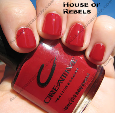
Crimson Uprising is a “shimmery crimson” that leans towards berry due to a slight pinkish undertone. I would consider it more frosty than shimmery but definitely not metallic. The application was too good for it to be called a metallic. The sliver and red shimmer give the shade depth and warmth. I wouldn’t say it’s entirely unique but it’s definitely pretty.
Rock Royalty is the first of my two “must have” polishes from this collection. It was described in Creative’s press release as a “dark purple creme” but from the close-up shot you can clearly see it’s not. The shimmer is comprised of very fine flecks of purple and pink that really only show up in direct sunlight but they’re there. The color itself is simply stunning. It’s what I had hoped the way too sheer OPI You Ottaware Purple would be. It’s not so dark that you can’t tell it’s purple yet it’s dark enough to be vampy.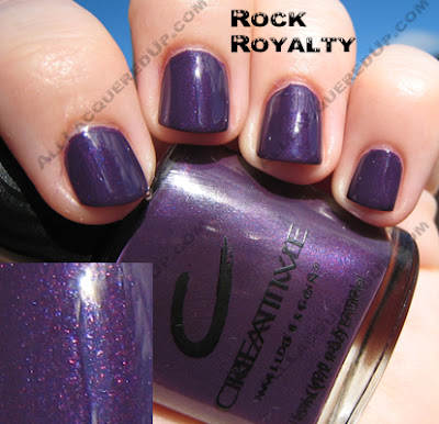
The piece de resistance is Hyde In The Dark. A “metallic anthracite” or as I like to call it, sparkly gray goodness, it’s not a metallic in the traditional sense, it’s a thousand times better. Loaded with shimmer and glitz, this is what gunmetal gray should look like. Now I don’t know what makes this formula different but it applied the best of all the polishes. I took pics of this one in both shade and sunlight to show off it’s glory.
 So everyone, what do you think? Are any of these tickling your fancy?
*edited to add: Imperial Anarchy will release in September. I don’t have an exact date.*


Now we´re talking

regal revenge looks a lot like OPI koala bear-ry? I´ll probably need them all.
I translated a post on my blog for you
You know, I don’t have Koala Bear-ry but after looking at a pic on NailGal.com, they are very similar. For anyone that wants to see:
http://nailgal.com/displayimage.php?pos=-3085
Thanks-I’ve been dying to see these. The last two are must-haves, but I may have to get them all. When are they gonna be available?
wow thank you, the bright clear pink and the red are just so beautiful. it’s winter here in hobart (a huge horrible frost this morning) so your sunny bright pics are so beautiful and cheering!
Woohoo! Rock Royalty and Hyde in the Dark are my faves!
Love it! Will have to get Regal Revenge, Rock Royalty and Hyde in the Dark. Thank you for the swatches!
which would you recommend, OPI’s “My Private Jet” or Creative’s “Hyde in the Park”??? THe colors look amazing
I like crimson uprising. Hey how about using a “no right click script” on your page so no one can steal your pics?
great idea on the right click script, except people who know what they are doing can still get the URL and steal the pics
I’m so glad you all like the pics. Thanks for checking them out and commenting.
Jennifer – I would chose Hyde in the Dark in second. While I love holo polishes, MPJ didn’t bowl me over.
e – I’m glad I could brighten your day down under. Did the OPI Australian collection get a lot of press?
Mina – I have thought about it but people can find ways around everything.
I’m with g.g., I’m drooling, looking at Rock Royalty and Hyde in the Dark! So pretty!
Linda
Those reds are foxy! i wonder how they will look displayed next to the other 40,000 reds I already have…
Hyde in the Park and Rock Royalty look exciting. I can’t wait, and thanks for doing the full manis! We appreciate it!
OK, loving crimson uprising! me and red metallics..hehe…I am developing an un healthy obsession!
I like crowned too, but me and gold’s just don’t do well together..and Hyde in the Park look pretty awesome..
I like Rock Royalty too!!!
hyde in the dark looks amazing! how does it compare to the similar shade that’s in the downtown zoya collection?
I know House of Rebels is listed as a creme, but does it have a little shimmer in it. It almost looks like it does in the photo, but it may just be the light. I can’t wait for Rock Royalty.
I looove Crowned and Hyde. But my skin tone (a pale asian flavor ) looks strange with yellows and golds.
I’m so tempted to try Crowned anyways, maybe this shade will be different.
For all of you eagerly awaiting this collection, it is now available at head2toebeauty.com (just ordered crimson uprising, rock royalty, and hyde in the park myself)! They’re only $2.99 a piece also. So cheap!! Can’t wait to get them.
If you like hyde in the park, check out OPI’s Light My Saphire- it is right smack inbetween a gunmental and navy. Tres Chic:)
Hi Tracy! Thanks for the suggestion. I reviewed Light My Sapphire back in the spring. It’s a lovely color but the formula was a little off for me. A bit too thick and hard to manage.
Aw, this was a really quality post. In theory I’d like to write like this too – taking time and real effort to make a good article… but what can I say… I procrastinate alot and never seem to get something done.