Fall 2009
CND Green Scene Colour and Gold Sparkle Effect
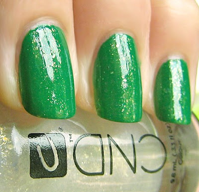
A green lover like me couldn’t resist the lure of Green Scene. I swear it was calling me from across the room at the CND launch party. It’s like I could hear it saying, “You know you want me. Get over here and play!” And play I did. When it came time to swatch the new colors, I had a ball testing different Effects over Green Scene and my fave of them all is Gold Sparkle.
Green Scene is very vibrant with a slight bluish undertone. The formula is smooth and well pigmented only requiring two coats. As I mentioned in my last CND post, the brush is flat but not too wide with triangular bristles that make application a breeze. Adding a layer of Gold Sparkle totally blinged out the look. Gold Sparkle is a clear base filled with multiple sizes of gold glitter. There are some large flecks dispersed among the micro-glitter giving a gilded finish.
 The CND Colour & Effects line will launch in the Fall at salons and spas in the US. Colours will retail for $9, Effects for $11. CND is carried in over 90 countries and you can find a salon or spa near you using the Salon Locator on the CND website.
Also, I wanted to address your comments and tweets regarding the pricing. We all have our own points of view regarding price and what is expensive to one person may be justifiably affordable to another. With that in mind, I try to review polishes without regard to cost but so many of you have been vocal about the price jump with CND. While the Colour price is not that much higher, the bottle is smaller. And if you want to recreate the look I’ve shown you, it will cost $20. Then again a bottle of Chanel is $23 and it’s just one look. It’s all in the eye of the shopper.
Now I’m not going to comment personally on the pricing but I will throw out my theory regarding the increase. The concept behind this line is that you’re compiling a nail wardrobe. That these are the only colors you need to create 800+ nail colors. In essence, once you buy their entire line, you’re done. So perhaps they feel this price is appropriate for the amount of color combinations you’re getting. That’s up to you to decide. Again, this is just my explanation and not coming from CND.
So with all that out of the way… what do you think of Green Scene? Don’t you just love how well Gold Sparkle compliments it?
Chanel Intermezzo and Gondola Le Vernis for Fall 2009
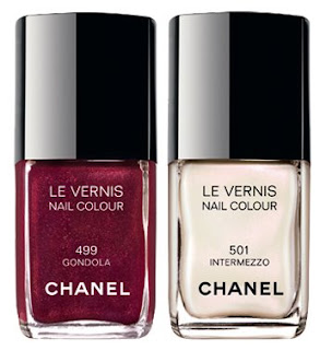 As a city built on water, Venice was a source of great intrigue for Gabrielle Chanel. She saw it as simultaneously dramatic and fragile – qualities she herself possessed. With the imagination of the CHANEL Makeup Studio, Venice comes to life in a palette reflective of the city’s shimmering facades and mosaics, and the sparkling aquatic colours of its lagoons.
As seen in the runway looks created by Peter Philips, Global Creative Director of CHANEL Makeup, at the 2009/10 Cruise Collection show, held on the beaches of Venice, Italy, rich sienna and deep rose tones, and dusky greys and greens combine for a modern look that can be softened for day or emboldened come evening.
Ahh Venice. How I long to go back. I spent three amazing days there with the Boyfriend back in 2002. We stayed in a gorgeous guest house, Palazzo Bembo, right on the canal near the Rialto Bridge. We spent our days wandering the maze of streets shopping, sightseeing and discovering the amazing food and wine of the region. This season Chanel aims to transport us to Venice with their fall colleciton inspired by the colors of this magical city. For nails they introduce Intermezzo, a white pearl, and Gondola, a stunning maroon shimmer. Let’s take a look.
Gondola is a rich burgundy sparkler. It is packed with gold and red micro-shimmer that catch the light adding a bit of jazz to what could be just another berry red. In typical Chanel fashion it’s a chic shimmer not a blingy glitter polish. It applied in two even coats and dried to a glossy, smooth finish.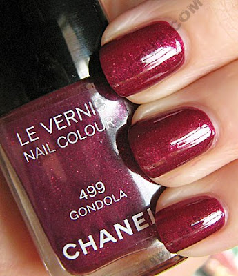
Intermezzo is an icy white with an opalescent shimmer that gives off a pinkish sheen in the light. I’m not gonna lie, I’m not really a fan of the formula. It applies pretty streaky, requiring three coats and even then my smile line shows through. The Chanel Fall collection Le Vernis lacquers retail for $23/ea and are available now on Chanel.com and at Chanel counters nationwide.
What do we think Fanatics? Are we loving these or what? Anyone planning to indulge?
butter London Fall/Winter 2009 Fashionista’s Favourites Sneak Peek
 OK so you remember that ah-mazing green from butter London that I spotted backstage at the Vena Cava show during New York Fashion Week? At the time, it seemed like forever until we’d get the chance to wear it. Well, the launch date is getting closer and closer and I have a preview of British Racing Green and the rest of the Fall 2009 butter London collection. OK so you remember that ah-mazing green from butter London that I spotted backstage at the Vena Cava show during New York Fashion Week? At the time, it seemed like forever until we’d get the chance to wear it. Well, the launch date is getting closer and closer and I have a preview of British Racing Green and the rest of the Fall 2009 butter London collection.
Nonie Creme, butter London Creative Director: Nails will be a huge part of your F/W wardrobe this year. Interesting nail colours with specific “personalities” will give you an opportunity to reinvent the many black, grey, and neutral outfits on offer. I designed a broad spectrum of colours for the Fall/Winter 2009 Fashionista’s Favourites. |
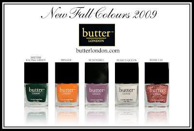
British Racing Green – The international motor racing colour of Great Britain. This green used to be the standard paint colour on all Formula One racecars in the days before sponsorship.
Dark, “hunter green” that was the backstage darling when used at the F/W 2009 shows.
Minger – British street slang for an ugly person. “Did you see that face? What a minger!”
An edgy burnt orange like the one featured on the Philip Lim and Prada catwalks. This shade “ups” the fashion factor of any outfit.
Scoundrel – An unprincipled, dishonorable person, villain, or scamp. Your ex-boyfriend, your builder, and your boss rolled into one.
A medium tone purplish-mauve that can appear darker or lighter depending on what clothing you are wearing.
Pearly Queen – A Pearly Queen is a woman dressed in a traditional Cockney costume covered in mother-of-pearl buttons.
A winter white with an added pearl sheen for softness and depth, making it beautifully wearable.
Rosie Lee – Cockney Rhyming slang for a cup of tea. “Put the kettle on Love, I fancy a Rosie Lee.”
A parade of pale pink glitter that will lift your spirits AND your outfit.
I won’t have actual samples to show you for a bit but according to Nonie, we should expect new packaging with this collection. Hmm, I wonder what it will look like. The bottle of Thames I have from over two years ago was square with a thin rounded cap, then came the flat wide bottles & caps.
Any predictions on how the shape will change? Which colors tickle your fancy? Share!
