Orange
Essie Resort 2016 Collection Swatches, Review and Comparisons
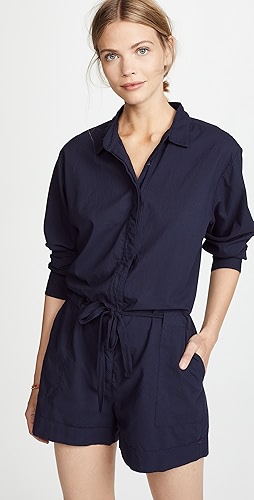
essie Resort 2016
From Caribbean beaches to African safaris to the North Fork coastline, the essie Resort palettes always promise us a colorful adventure. This year we are off to India with the bold-hued essie Resort 2016 collection. Inspired by the opulent silks, saturated hues and golden desert sands, these four colors are taking us on one vibrant ride.
Continue Reading »
OPI Color Paints Swatches, Review & Nail Art
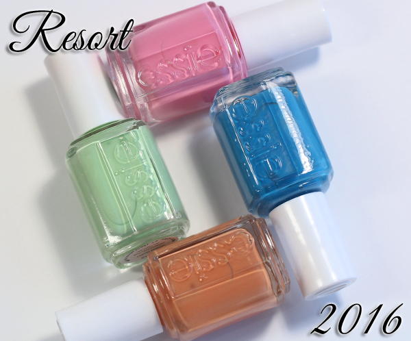
OPI Color Paints review
OPI dipped their toe in the water of sheer, buildable color when they released the Sheer Tints Top Coats last year. While those were a good idea for layering, nail art, etc., the top coat formulation had its limitations, namely bubbling. Fast forward a year and we have the OPI Color Paints, a collection of eight intensely pigmented jelly polishes, and one silver chrome base color, that have a wide range of uses.
Continue Reading »
Sally Hansen Spring 2015 Tracy Reese Swatches & Review
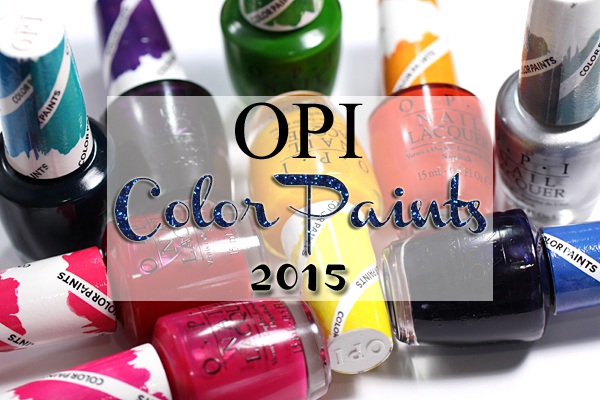
Sally Hansen Spring 2015 Tracy Reese
I’ve been hoarding the Sally Hansen X Tracy Reese collaboration colors ever since they brought the amazing Arabian Nights into our lives in 2008. Their synergistic partnership rolls on with the Spring 2015 collection, their eighteenth, to complement a dancer-inspired runway collection full of dramatic silhouettes and bold patterns.
Continue Reading »
China Glaze Electric Nights Summer 2015 Swatches & Review
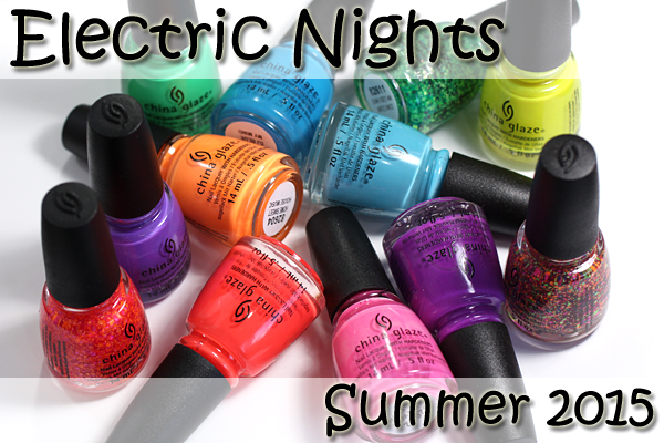
China Glaze Summer 2015 – Electric Nights
Calling all music fans. The festival season is coming, and whether you’re heading to Bonnaroo, the Governors Ball, or just dancing it out at home, China Glaze wants to deck out your tips and toes with club-ready brights. The China Glaze Electric Nights collection for Summer 2015 introduces nine bold hues and three neon top coats!
Continue Reading »
Nubar Spring 2015 Pop! Swatches & Review
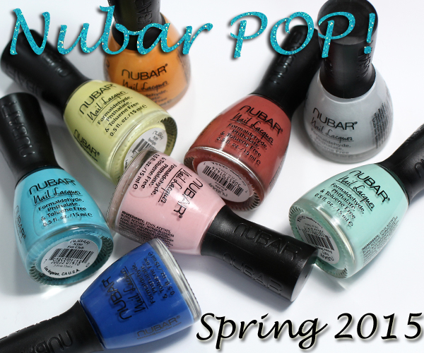
Nubar Spring 2015 – Pop!
As I told you last week, grey, aqua and mint are some of my favorite shades this spring. The Nubar Spring 2015 Pop! collection hits on all those spots and more. I’ll admit, it’s been a minute since I’ve been giddy about a Nubar collection, but this one is giving me butterflies. Keep reading to see why.
Continue Reading »