Gray
Zoya Fall 2015 Flair Swatches & Review
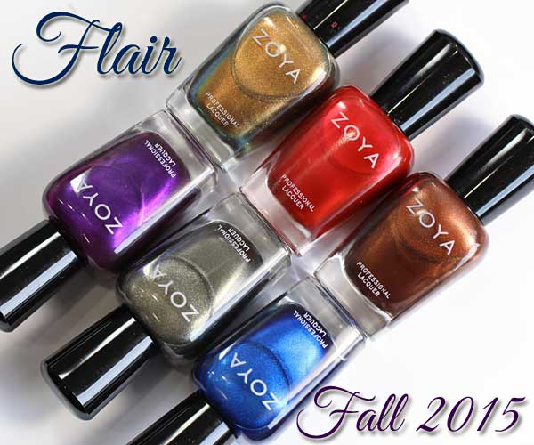
Zoya Fall 2015 – Flair
As I shared during last night’s #NailGlossip chat (next one is 8/30), Fall is my favorite time of year for nail color. I love the saturated jewel tones and sparkle that tend to accompany the season. So, when the Zoya.comZoya Fall 2015 collections landed on my doorstep, I had to play with Flair first.
Can I just say how much I love that Zoya releases one creme collection and one shimmer/sparkle collection for the major seasons? Some of my all-time favorite colors have come from Zoya fall palettes and this year is shaping up to follow that pattern. There are a couple colors here that I know I’ll wear over and over this season.
Continue Reading »
a-england Rossetti’s Goddess Swatches & Review
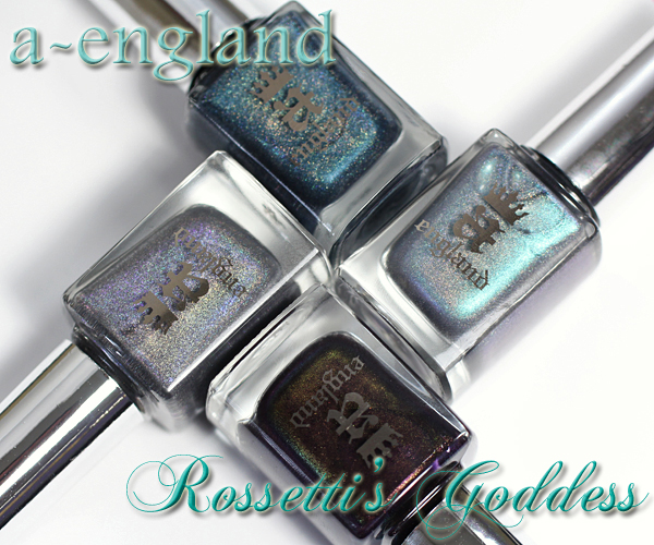
a-england Rossetti’s Goddess review
There’s no better time to enjoy holographic and duo-chrome shimmer than summer. The bright sunlight electrifies the prismatic shimmer for an eye-catching effect. The a-england Rossetti’s Goddess collection, inspired by Rossetti’s painting of the Roman goddess, Proserpine, is a buffet of summer-fun sparkle.
Continue Reading »
Deborah Lippmann Summer 2015 Painted Desert Swatches & Review
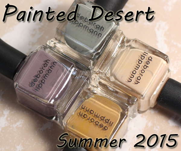
Deborah Lippmann Summer 2015 Review
Manicure maven, jazz singer and entrepreneur, Deborah Lippmann may be a chic Manhattanite, but this summer, she’s taking us on a southwest adventure to her home state of Arizona with the Painted Desert collection. At a time when brands are bombarding us with brights, Deborah Lippmann dances to the beat of her own drummer with an earthy palette that pays homage to her roots.
Continue Reading »
Essie Spring 2105 Flowerista Swatches & Review
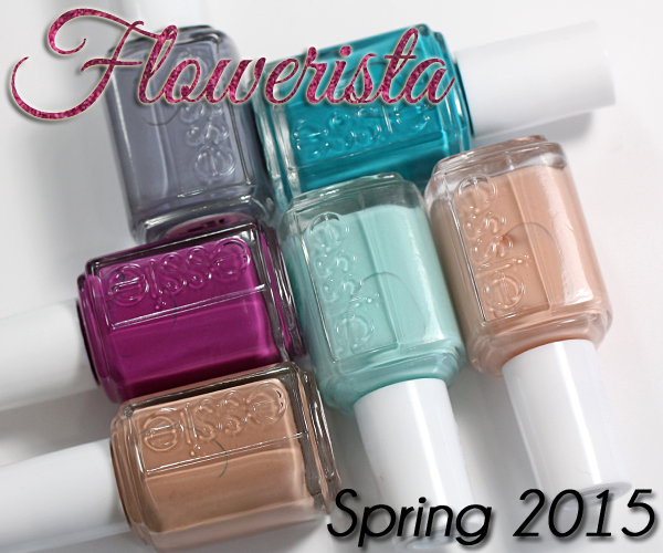
Essie Spring 2015 – Flowerista
I couldn’t be more thrilled to see one of my favorite accessory designers, Rebecca Minkoff, working with one of my favorite nail polish brands. The Essie Spring 2015 Flowerista collection is the first one Minkoff had a hand in, and I’m already loving this partnership. Bright saturated shades are mixed with more neutral hues for a nice juxtaposition between bold and subdued.
Continue Reading »
Nubar Spring 2015 Pop! Swatches & Review
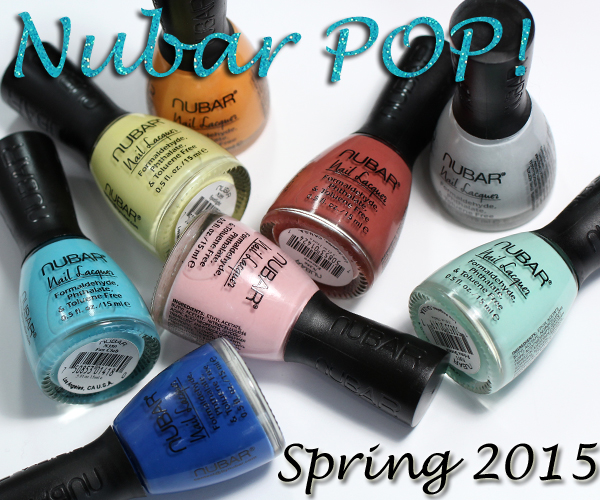
Nubar Spring 2015 – Pop!
As I told you last week, grey, aqua and mint are some of my favorite shades this spring. The Nubar Spring 2015 Pop! collection hits on all those spots and more. I’ll admit, it’s been a minute since I’ve been giddy about a Nubar collection, but this one is giving me butterflies. Keep reading to see why.
Continue Reading »