Chanel
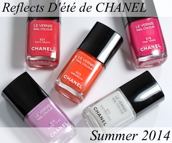
CHANEL Summer 2014 Nail Polish from Reflets D’Été de Chanel
Mix. Match. Mismatch. The pairing possibilities are endless…the bolder, the better.
The overiding theme of Chanel’s Summer 2014 Collection, Reflets D’Été de Chanel, is all about mixing rich, bold color. The four, new super saturated Chanel nail polish shades (Eastern Light is a re-promote) certainly lend themselves to the art of color combining.
Continue Reading »
Oscars 2014 Nails – Nude Are You Wearing?
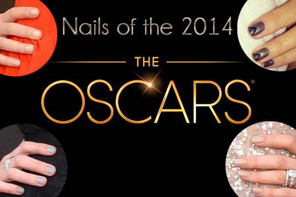
If there’s one big color trend from The Oscars 2014, it would be a lack of color, as nudes ruled the day. From barely there lips and tips to flesh-toned gowns, this is one Oscar year when the red carpet didn’t have a lot to compete with. Of course, there were a few standout moments but they were few and far between.
Continue Reading »
Chanel Charivari & Tapage Le Vernis for Spring 2014
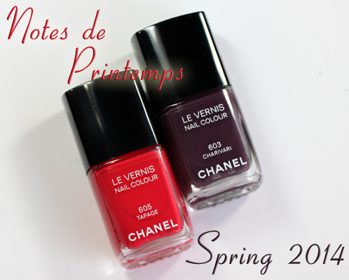
In what seems like another world, a long, long time ago, I was somewhat of an accomplished musician (aka band geek). I have stacks of music that I leave in a visible place, as a promise to practice in hopes of joining a community orchestra, someday. I really miss playing.
Which is why the musical theme of Chanel’s Notes de Printemps (Notes of Spring) Spring 2014 collection resonated with me. Playful pinks and purples are at the core of the collection and that theme comes through in the two new shades of Chanel Le Vernis, Charivari (pandemonium) and Tapage (noise).
Continue Reading »
Guest Post – A Spring Eye Makeup Tutorial by Brooke from Blushing Noir
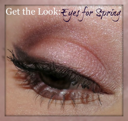
Even though I’ve been friends with Brooke from Blushing Noir for a while now, I didn’t actually meet her until last October when we went #Nailgating at the Browns vs Steelers game and I instantly fell in like with her sassy, spunky personality. Though she’s a terrible enabler and I fear the day we hit the Saks beauty department together. Actually, my wallet does.
One of the things I admire about Brooke as a beauty girl is her eye shadow blending skill. Like the black and gold eye she created for the game was GORGEOUS. So when I asked her to contribute a guest post, I requested she show me a new spring eye look and she hit it out of the park. Check it!
Continue Reading »
Best of 2013 – Top 30 Nail Polishes of the Year
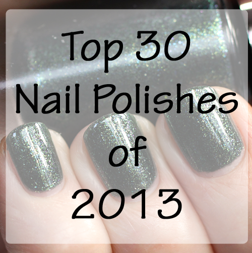
It’s been a pretty stellar year for nail polish. In 2013, we’ve seen new technologies, new finishes and tons of new colors. So you can imagine what a task it’s been trying to narrow down my favorites.
The new textured polishes really helped invigorate my passion for polish. Unlike other fad-type finishes of the past few years (crackle, matte, magnetic, etc), I’m so not tired of texture and I don’t see my love waning anytime soon.
After an unexpectedly long break from ALU, I came back this year with a vengeance and I’ve been loving every second of it. A huge part of that is you. Your comments, emails, tweets, etc. mean so much and encourage me to share my love of nail color. So without further ado, I give you my Top 30 Nail Polish Colors of 2013.
Continue Reading »