
Essie Bahamas Swatches
 Essie has teamed up with the Atlantis Resort on Paradise Island, the Bahamas Ministry of Tourism and Kamalame Cay to create a special summer collection. As part of the It’s Better In The Bahamas promotion you can win a trip to the gorgeous tropical locale. Check out the Essie website for an entry form and details.
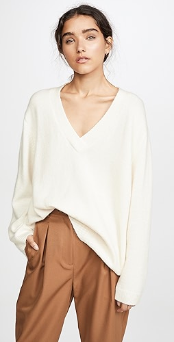
Ok, I’ll be honest with you. When I see the colors in this collection, I don’t think Bahamas or beach or ocean. With the exception of Jumpin’ Junkanoo and The Cove Copper the rest of the colors seem like typical safe shades for the company that has built an empire on pinks, reds and sheers.
Now I haven’t been to the Bahamas myself but I have been to many of the Caribbean islands and if I had created a collection based on the culture and area it would be filled with hot pink, coral, sea green, opalescent shell pink and a sandy shimmer. But we all have different visions and this is Essie’s. It seems to me that she decided to create shades that flatter the women of the islands rather than reflect on their surroundings.
 (l-r) The Cove Copper, Lyford Lilac and Jumpin’ Junkanoo


Alright, so now it’s your turn to weigh in. I’m sure by now some of you have tried these. What are your “must have” and “I’ll pass” shades? Help keep your fellow polish junkies from missing out on a “holy grail” or wasting money.


Thanx for the informative reviews. Based on your comments and the fact that I am very fair, the only 2 colours I might consider getting are: Jumpin Junkaroo & Atlantis Pearl. I won’t be holding my breath though – I expect South Africa to get this collection only next year (when our Fall comes around).
I got Bahama Mama and The Cove Copper (which I’ve renamed Copper Cove b/c it flows better) over the weekend and LOVE them!!
I like Atlantis Pearl and Bahama Mama the best, so maybe I will purchase those.